
Responsive & Mobile-First Design
Sites that look great and work well on every device, designed mobile first.
Get a Quote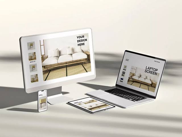
Responsive and Mobile-First Web Design for Seamless Multi-Device Experiences
With smartphones dominating how people access the internet today, having a website that looks and performs exceptionally well on mobile devices is no longer optional—it is vital for business success. A Must Element provides professional web design services rooted in Responsive and Mobile-First principles to ensure flawless performance across every screen size.
Building with a Mobile-First approach means designing from the smallest screen upward. This guarantees that critical elements like menus, buttons, and content are intuitively placed for mobile users before scaling up smoothly to tablets and desktop computers. This strategy eliminates awkward zooming, horizontal scrolling, and broken layouts.
We focus on delivering optimal user experiences through robust Responsive and Mobile-First practices across key features:
-
Flexible grid layouts that automatically adapt fluidly to any screen size or orientation.
-
Touch-friendly navigation, buttons, and interactive elements optimized for mobile thumb interaction.
-
Fast-loading images and optimized assets designed to perform smoothly on mobile data networks.
-
Clear, readable typography and content structuring regardless of the viewing device.
-
Full alignment with modern search engine standards to boost mobile SEO performance and rankings.
Our Design Process:
-
Audience Analysis to understand device usage behaviors and outline mobile UX strategies.
-
Mobile-First Wireframing to design core layouts prioritizing smartphone viewports first.
-
Responsive Development & Cross-Device Testing to ensure flawless visual rendering across diverse screens.
-
Performance Optimization & Launch to deliver high-speed, fully responsive websites ready for users.
Websites by business type
E-Commerce Web Development MLM Web Development Website Design for Tourism Businesses Website Design for Bungalows Website Design for Car Rental Businesses Website Design for Resorts Website Design for Housing Developments Website Design for Guest Houses Website Design for Hotels Website Design for Homestays Website Design for Real Estate Businesses Website Design for Restaurants Website Design for Clinics Website Design for Tutoring Schools Website Design for Schools Website Design for Companies Website Design for Factories SEO-Ready Website Design Responsive Website Design